EVALUATION QUESTION 1 DRAFT
In what ways does your media product use, develop or challenge forms and conventions of real media products?
Illustrating a unique and innovative idea is often difficult with an unremarkable, overplayed song. Therefore, to appeal to the niche market of the trendy, lo-fi loving youth of today, we chose to create a music video for the song ‘Billie Holiday’ by the harmonious art-rock group, Warpaint. The inventive, melodic track by the all-girl band is popular within our group, as is the lo-fi, dream-pop genre. We chose to develop the video as a means of promoting our tastes and encouraging interest in the band.
When beginning to develop our video, we took the philosophies - those concerning music videos - of many theorists into account, most notably those of Andrew Goodwin. His theory applies the idea that there are five basic properties which a music video should have in order to focus an audience; narrative and performance, thought beats, star image, the relation of the song to the visuals and, of course, the technical aspects of a music video.
Although we agree that narrative and performance are key features that aid the production and reception of a video, we also challenged this theory by adding a stimulatingly ambiguous storyline, which actively inclines the audience to interpret the themes and ideas personally. The song, and therefore the lyrics of ‘Billie Holiday’ exemplify themes of love, lust and heartbreak. We have used these ideas to develop our video, with the narrative implying that the couple have a turbulent relationship. We have not included both of the characters in the same shot, but used graphic matches to represent how they have similar feelings even though they are not together. We have not only challenged Goodwin’s theory, but we have also developed it for, in our opinion, a more effective and thought-provoking music video, rather than a tedious, trite one. The basis of the video is to show that the female character has been unfaithful to the male character. At the end of the video he, in anger, tears off his neck-tie and throws it into the lapping waves. This also shows irony as the lyrics breakdown of the song shows “nothing you can do can make me untrue to my guy.” This satirical view is also used in real media products, such as the music videos for ‘Dirty Cash’ by Dizzee Rascal and ‘Learn to Fly’ by Foo Fighters.
We also included a series of lip-syncs to emphasize the facial expressions of the characters, which in turn reflect the mood and themes within the video. We have edited cuts to the beat of the video, such as the turning off of a light on the beat when the mood of the song changes, and a perpetual slow pace when the mood and beat is constant. This technique is similar to those used in real media products of the same genre and supports Goodwin’s theory of thought beats enhancing a music video. However, we have also challenged this by adding cuts when the beat does not change. The song, by its very nature is slow and séance-like with a soft, unchanging tone. We therefore added cuts when the beat does not change, but when the end of a line of lyrics finishes. However, as the song comes to a climax, there is a sudden fast pace within the song; we intercut shots of the characters at fast speed, with exaggerated facial expressions to emphasize the dramatic ending of the relationship. This technique is also used in the videos for ‘Stars’ by Warpaint and ‘Spitting Blood’ by WU LYF.
We have tried to steer clear of illustrating a specific star image, and have used simple shots of a female singer dressed in vintage clothing and modest make-up, similar to the original music video, as well as many other music videos from artists of the same genre, such as Best Coast, Dum Dum Girls and Sleigh Bells. The male character wears a timeless outfit of a plain white shirt, black tie and trousers. This also nods to the French new-wave, as the outfit is similar to those worn by Jean-Paul Belmondo in ‘À bout de souffle’ and Sami Frey in ‘Bande à part’. We developed these costumes not only because they are uniquely fashionable, but also to show our influences throughout the video. This challenges and develops Goodwin’s theory of star image, and although our video does not focus on a particular ‘star’, it shows how the ambiguous narrative and innovative performance work in harmony to illustrate our ideas, without the need for meet shots of scantily-clad women or a tween boy-band to attract the audience. This develops Goodwin’s theory of star image, making the music video more ambiguous and haunting - the main themes within the song. This also relates the song and lyrics to the visuals.
When filming the visuals for the song, we took Goodwin’s theory of relation into account. We adhered to the conventions and developed the ideas of amplification and illustration, but also challenged Goodwin’s theory by disregarding disjuncture. We thought that to disregard the song completely, such as in Daft Punk’s ‘Da Funk’, would be less effective than building narrative and visuals around the lyrics, tone and pace. We chose amplification as our main method of correlation, as well as some illustration. The video, in that sense, is similar to the music videos for Best Coast’s ‘When I’m With You (I Have Fun)’ and M83’s ‘We Own The Sky’. We used a simple narrative of love and heartbreak to develop themes within the video, as well as only a few characters to focus audience attention. We also used illustration; for example, when the lyrics are ‘like birds of a feather, we stick together’ our video shows a flock of birds. Our media product both adheres to and challenges the conventions of real media products, as well as developing Goodwin’s theory of relation of visuals to lyrics and song.
EVALUATION QUESTION 2 DRAFT
How effective is the combination of your main product and ancillary texts?
Throughout these media processes, we have tried to maintain a level of continuity within our products by using constant typeface, similar images and consistent branding. We feel that this continuity is necessary when trying to appeal effectively to any audience, especially one as diverse in age and gender as ours. The dream-pop, lo-fi vibe that we began to project via the video itself has been additionally demonstrated within our Digipak and all of our other promotional products. It has been important to keep or messages clear and coherent so as not to confuse the audience, and similarly to create a recognisably branded product. By successfully applying these methods of advertising and merchandising, we have created a wide selection of digital promotion media including;
- A 6-framed CD package with customised disc,
- A DVD package with pull-out image and information,
- A magazine advertisement,
- A magazine review,
- Two A3 posters,
- A limited edition customised vinyl and sleeve,
- and a pair of cotton t-shirts.
These promotional products bare discernible similarities to the shots, colours and themes of our music video, and the continuous subject matter including foliage, clouded skies, an abandoned car, several abandoned buildings, moving traffic and of course, the vocalists and characters within the video. These similarities persistently link the promotional products with the video itself, therefore linking all products and forming a recognisable Digipak.
On the CD, DVD and vinyl covers, as well as the t-shirt, magazine cover and advertisement, we have included the image of an abandoned, rusting car, which was a prominent setting within the video. The photo was taken on a Pentax Spotmatic film camera, so the colours and tones are largely accentuated. We feel this easily recognisable icon will allow the audience to naturally relate the media products to the video, and promotion by the mere sight of these ancillary texts will be effective. The actual car, although rusting and neglected, is beautiful in its own way. As the thick green nettles that grow around it highlight the red of the bonnet and contrast the blue of the sky, the dented door of the driver’s side hangs by its hinges, its angle emphasised by the decaying ruins of the building behind it. We felt this image was powerful enough in colour, subject and composition to signify our products. Not only is the image aesthetically pleasing, but also enigmatic and attention grabbing - qualities which will draw the audience to the product.
The inside covers of the CD case and vinyl sleeve incorporate an image of the angular wooden beams behind the car. The photo was also taken on a Pentax film camera, so the colours are vivid and striking. We used similar shots using these geometric shapes in our video, which will add continuity to our range of products. This image was also used as the base for our second t-shirt, poster, cassette case and magazine article. The images of the rusting car and of the angular beams work in harmony; the blue tone of the sky is constant in both, as well as the sense of decay and abandonment
 "Yes! This is my favourite one!"
Throughout these media processes, we have tried to maintain a level of continuity within our products by using constant typeface, similar images and consistent branding. We feel that this continuity is necessary when trying to appeal effectively to any audience, especially one as diverse in age and gender as ours. The dream-pop, lo-fi vibe that we began to project via the video itself has been additionally demonstrated within our Digipak and all of our other promotional products. It has been important to keep or messages clear and coherent so as not to confuse the audience, and similarly to create a recognisably branded product. By successfully applying these methods of advertising and merchandising, we have created a wide selection of digital promotion media including;
- A 6-framed CD package with customised disc,
- A DVD package with pull-out image and information,
- A magazine advertisement,
- A magazine review,
- Two A3 posters,
- A limited edition customised vinyl and sleeve,
- and a pair of cotton t-shirts.
These promotional products bare discernible similarities to the shots, colours and themes of our music video, and the continuous subject matter including foliage, clouded skies, an abandoned car, several abandoned buildings, moving traffic and of course, the vocalists and characters within the video. These similarities persistently link the promotional products with the video itself, therefore linking all products and forming a recognisable Digipak.
On the CD, DVD and vinyl covers, as well as the t-shirt, magazine cover and advertisement, we have included the image of an abandoned, rusting car, which was a prominent setting within the video. The photo was taken on a Pentax Spotmatic film camera, so the colours and tones are largely accentuated. We feel this easily recognisable icon will allow the audience to naturally relate the media products to the video, and promotion by the mere sight of these ancillary texts will be effective. The actual car, although rusting and neglected, is beautiful in its own way. As the thick green nettles that grow around it highlight the red of the bonnet and contrast the blue of the sky, the dented door of the driver’s side hangs by its hinges, its angle emphasised by the decaying ruins of the building behind it. We felt this image was powerful enough in colour, subject and composition to signify our products. Not only is the image aesthetically pleasing, but also enigmatic and attention grabbing - qualities which will draw the audience to the product.
The inside covers of the CD case and vinyl sleeve incorporate an image of the angular wooden beams behind the car. The photo was also taken on a Pentax film camera, so the colours are vivid and striking. We used similar shots using these geometric shapes in our video, which will add continuity to our range of products. This image was also used as the base for our second t-shirt, poster, cassette case and magazine article. The images of the rusting car and of the angular beams work in harmony; the blue tone of the sky is constant in both, as well as the sense of decay and abandonment
 "Yes! This is my favourite one!"
EVALUATION QUESTION 3 DRAFT
What have you learned from your audience feedback?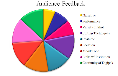 A visual representation of our Audience Feedback. We developed an anonymous questionnaire and invited the audience to score aspects of our media product out of 10. The larger the segment, the stronger the audience believed the aspect to be, and vice versa.
 A visual representation of our Audience Feedback. We developed an anonymous questionnaire and invited the audience to score aspects of our media product out of 10. The larger the segment, the stronger the audience believed the aspect to be, and vice versa.
EVALUATION QUESTION 4 DRAFT
How did you use media technologies in the construction, research, planning and evaluation stages?
AUDIENCE FEEDBACK
View more presentations from Hannah Godfrey.
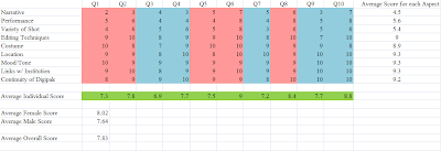
After collecting and organising these results, I designed a graph to display the information. Each aspect is noted on the graph, with the correlating scores which each questionee (Q1-10) awarded it. Ten audience members took part, 5 males and 5 females aged between 16 and 19. The pink columns represent female questionees, while the blue represents male. I then used the averaging function in Microsoft Excel to generate average scores for each aspect, taking each questionnaire into consideration and thus allowing us to determine which aspects we exercised strongly, and similarly, those we did not. I also took an average individual score from each questionee to give a rough idea of their opinions - this is the green row. As well as that, I generated male and female averages, to see if there was a difference in the response between genders - there was, and it indicated that females responded better to the video than males, giving it an average 8/10 compared to the males who only awarded 7.6/10. Finally, I generated an overall average - 7.83/10 - which allowed us to gain a final and clear understanding of our audiences opinions.
To further illustrate our audience feedback, I converted our results into a visual Pie Chart. The larger the segment, the stronger the audience believed the aspect to be, and vice versa.

CD DIGIPAK DEVELOPMENT
DRAFT

DEVELOPMENT
When developing our video, I took several recce shots of the settings we had planned to use. I used a Cannon digital camera to take some, but also used a Pentax Spotmatic film camera to take others. The images from the film camera were developed with more striking and vivid colours, so much so that we chose to use some of them for our Digipak. Here are a few examples of the images we chose from.


 After a lot of thought, we chose to pair the image of an abandoned car with a picture of the looming wooden beams behind it. The car would act as the cover, while the beams would be inside the CD case. The vivid blue of the sky is consistent throughout both images, as is a sense of decay and abandonment, which are some of our main themes. This particular setting is local and easily accessible, therefore the filming was relatively easy. We also used this place as a prominent setting within our video, adding consistency to our media products.


DEVELOPMENT

When developing our video, I took several recce shots of the settings we had planned to use. I used a Cannon digital camera to take some, but also used a Pentax Spotmatic film camera to take others. The images from the film camera were developed with more striking and vivid colours, so much so that we chose to use some of them for our Digipak. Here are a few examples of the images we chose from.


 After a lot of thought, we chose to pair the image of an abandoned car with a picture of the looming wooden beams behind it. The car would act as the cover, while the beams would be inside the CD case. The vivid blue of the sky is consistent throughout both images, as is a sense of decay and abandonment, which are some of our main themes. This particular setting is local and easily accessible, therefore the filming was relatively easy. We also used this place as a prominent setting within our video, adding consistency to our media products.

MAGAZINE REVIEW

‘Billie Holiday’ – Warpaint
VOID Records 2011
Without a doubt one of the most beautifully depressing albums of the year, all of the tracks on ‘Billie Holiday’ have the strange ability unlock the poignant and changeable nature within us all.
From the heartbreaking and melodic tones of ‘Undertow’ to the miserable, stylised synths of ‘Stars,’ the entire album tells a devastating story of love, lust and disappointment. Vocals from singer-guitarists Emily Kokal and Theresa Wayman resonate powerfully within a thick mist of guitars and bass. The group take inspiration from the legendary Billie Holiday and use her namesake, as well as integrating lyrics from ‘My Guy’ seamlessly into the track of ‘Billie Holiday’, which also appears on Warpaint’s ‘Exquisite Corpse’ EP. The effortlessness that surrounds the all-girl band allows every track to feel completely natural and instinctive. The nine-track séance is available now on iTunes from VOID Records.
ADDING TEXT OVERLAY
After creating the text clip, I typed in the first letter, changed the tracking to 26, and the aspect to 1.5 to reach our desired size and placement.
I then finely tweaked the size and placement of the clip to fit the song, and I repeated this for each letter.
I then copied an d pasted the same set of letters on the timeline as the same thing is repeated in the song four times. Since the track was not sampled, each time will be different, so I had to tweak it each time.
The reason for this addition to the video is purely artistic; it could be said that this was inspired by WU LYF's video for "L Y F" because white text is overlayed in that video too.
INSPIRATION: FILM
Weekend - Jean Luc Godard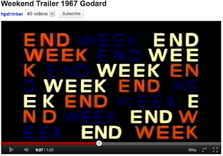 We will try to incorporate this type of stylized text into our video as it gives an artistic touch, nodding to the French new-wave.
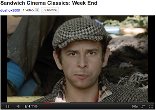 Medium close-ups like this will help to focus the audiences attention on the feelings and emotions of the characters. This will add a more intense atmosphere to the video.
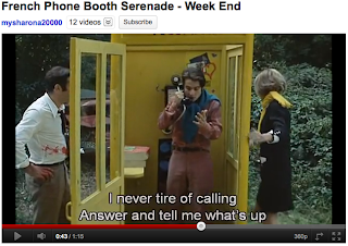 This medium shot of the three characters will help to illustrate their turbulent relationship.
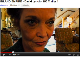
Inland Empire - David Lynch Close-ups of strange and extraordinarily creepy items and faces will help us to develop a dream-like, surreal atmosphere within the video.
Kids - Larry Clark
 Images of shocking youth culture are generally received well in music videos, as teenagers can often relate to the rebellious and irreverent scenes.
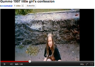
Gummo - Harmony Korine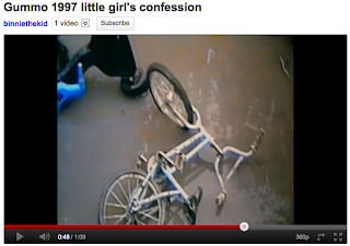 Shots of rusting machinery etc. will help to develop a sense of abandonment within the video, as this is what we are trying to metaphorically portray within the characters.

 We will try to incorporate this type of stylized text into our video as it gives an artistic touch, nodding to the French new-wave.
 Medium close-ups like this will help to focus the audiences attention on the feelings and emotions of the characters. This will add a more intense atmosphere to the video.
 This medium shot of the three characters will help to illustrate their turbulent relationship.
Inland Empire - David Lynch
 Close-ups of strange and extraordinarily creepy items and faces will help us to develop a dream-like, surreal atmosphere within the video.
Kids - Larry Clark

 Images of shocking youth culture are generally received well in music videos, as teenagers can often relate to the rebellious and irreverent scenes.
Gummo - Harmony Korine
 Shots of rusting machinery etc. will help to develop a sense of abandonment within the video, as this is what we are trying to metaphorically portray within the characters.

INSPIRATION: MOODBOARDS
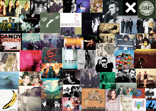 Within this moodboard we have collected and displayed photos, album covers and promo shots for artists that will influence our music video and digipak. Our main influences include Scoutt Niblet, Sigur Ros, Galaxie 500, Wu Lyf, MGMT and Neutral Milk Hotel, which all have surreal, psychedelic songs and videos.
INSPIRATION: MUSIC VIDEOS
For our video, we have taken inspiration from videos of the same genre which we feel will express the song well including colour, effects, shot-type and style.
Girls - Lust For Life

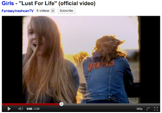
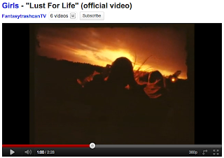 These shots from the Girls' video for 'Lust For Life' show a girl, silhouetted by the sunset. We feel that shits like this will give our videos a dreamy and summery feel, like the similar shots from the M83 video.
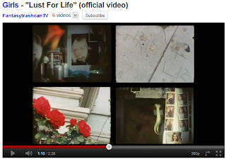 However, this split-screen effect is to hectic for our tastes, and if we were to use a split screen it would be limited to two shots, to show contrast and similarity between the two characters.
Black Lips - Drugs
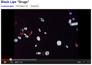

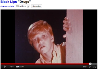
This video for 'Drugs' by Black Lips uses vintage-looking footage to illustrate the hallucinogenic and mind-altering effects of drugs. We will try and replicate some of the shots, particularly the first one, but possibly with leaves or sand instead of pills.
Warpaint - Stars
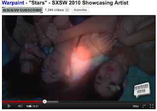
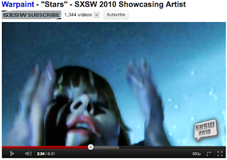

This naturalistic video includes slow-motion shots, underwater shots, superimposition, surreal light effects and natural settings. We will try and emulate some of these properties in our video, as we feel they go well with the genre. The shots with a projector are also effective and we may use this technique.
Lana Del Rey - Video Games/Blue Jeans
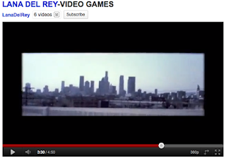

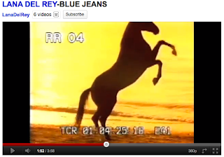
These videos by Lana Del Rey are almost like a compilation of vintage Super8 footage, clips of popular influences like Snoop Dogg and Paz de la Huerta, skateboarding videos, home movies, neon lights, panoramas and finished off with shitty clips of her singing into a webcam. We like the overall effect that the videos create, but the cheesy and unprofessional performance combined with inconsistant editing gets a big thumbs down from us.

M83 - We own the Sky
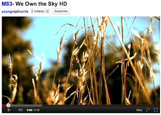

This use of light and focus in this video give it a dreamy summer feel which we think will work well in our video. A shot similar to the one of the corn field above will link in well with our theme, as will the running through the field shot, however we will be filming bare feet running through a field and additionally through the surf on a beach.
Girls - Lust For Life


 These shots from the Girls' video for 'Lust For Life' show a girl, silhouetted by the sunset. We feel that shits like this will give our videos a dreamy and summery feel, like the similar shots from the M83 video.
 However, this split-screen effect is to hectic for our tastes, and if we were to use a split screen it would be limited to two shots, to show contrast and similarity between the two characters.
Black Lips - Drugs


This video for 'Drugs' by Black Lips uses vintage-looking footage to illustrate the hallucinogenic and mind-altering effects of drugs. We will try and replicate some of the shots, particularly the first one, but possibly with leaves or sand instead of pills.
Warpaint - Stars


This naturalistic video includes slow-motion shots, underwater shots, superimposition, surreal light effects and natural settings. We will try and emulate some of these properties in our video, as we feel they go well with the genre. The shots with a projector are also effective and we may use this technique.
Lana Del Rey - Video Games/Blue Jeans


These videos by Lana Del Rey are almost like a compilation of vintage Super8 footage, clips of popular influences like Snoop Dogg and Paz de la Huerta, skateboarding videos, home movies, neon lights, panoramas and finished off with shitty clips of her singing into a webcam. We like the overall effect that the videos create, but the cheesy and unprofessional performance combined with inconsistant editing gets a big thumbs down from us.

M83 - We own the Sky


This use of light and focus in this video give it a dreamy summer feel which we think will work well in our video. A shot similar to the one of the corn field above will link in well with our theme, as will the running through the field shot, however we will be filming bare feet running through a field and additionally through the surf on a beach.
Subscribe to:
Comments (Atom)


