View more presentations from Hannah Godfrey.
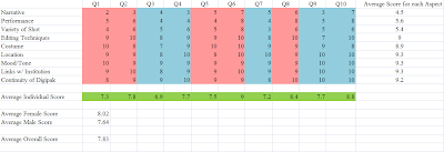
After collecting and organising these results, I designed a graph to display the information. Each aspect is noted on the graph, with the correlating scores which each questionee (Q1-10) awarded it. Ten audience members took part, 5 males and 5 females aged between 16 and 19. The pink columns represent female questionees, while the blue represents male. I then used the averaging function in Microsoft Excel to generate average scores for each aspect, taking each questionnaire into consideration and thus allowing us to determine which aspects we exercised strongly, and similarly, those we did not. I also took an average individual score from each questionee to give a rough idea of their opinions - this is the green row. As well as that, I generated male and female averages, to see if there was a difference in the response between genders - there was, and it indicated that females responded better to the video than males, giving it an average 8/10 compared to the males who only awarded 7.6/10. Finally, I generated an overall average - 7.83/10 - which allowed us to gain a final and clear understanding of our audiences opinions.

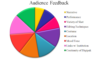
To further illustrate our audience feedback, I converted our results into a visual Pie Chart. The larger the segment, the stronger the audience believed the aspect to be, and vice versa.


