
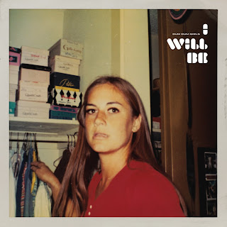
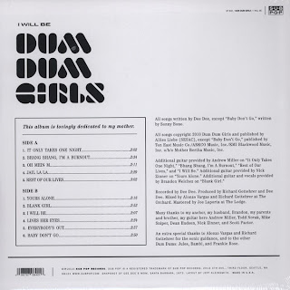
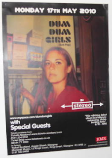
 This is the Digipak and poster for Dum Dum Girl's album 'I Will Be' on Sub Pop. The poster is from a gig in Glasgow in 2010, and uses the same picture as the album, which allows the audience to relate that image to the band. As the foreword on the back of the pack states 'This is lovingly dedicated to my mother'. This means Dee Dee's (the main singer) mother, who died from a terminal illness while the album was in production. This shows Dee Dee's affection towards her mother, along with the Polaroid of her when she was young on the album cover. This gives a solemn but uplifting feel to the album, and helps the audience relate to the band. It also gives the album a vintage feel, which is also exaggerates their genre of music. The red colour of her shirt on the album cover is emulated on the vinyl, giving the Digipak consistency. The white bubble-type font contrasts with the soft tones of the photo, drawing the audience's eyes straight to the band's name and album title, making the album easily recognisable. This font is also used on the poster, but in black, to a lesser effect. The back of the album has a simple black and white track list, along with thanks to producers and additional musicians. This is effective because it allows the audience to concentrate on the actual content of the album rather than just graphics which distract the eye. The white background is contrasted with black font, using the same typeface as the front cover, also giving the album consistency. The tracks on Side A and B are listed in chronological order along with their running times; '1. It Only Takes One Night..........2:02'. The logo of the record label, S.U.B P.O.P, is small in the top right hand corner. The actual design of the CD is using the consistent font with a 3D effect; blue over red. This simple and effective technique using overlaying colours give the design depth, and is more interesting than a conventional reflective CD.
 Album: Dum Dum Girls - He Gets Me High
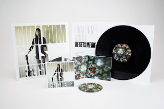
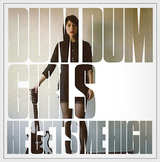
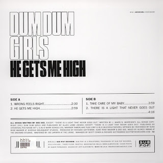

This is the Digipak for another Dum Dum Girls album 'He Gets Me High'. The actual album cover looks quite intricate but is actually quite simple. The effective technique of placing a photo of Dee Dee holding her guitar underneath the text gives the effect of looking through a type of window into her life, allowing the audience to both relate to and idolise her. She shows her tattoos, wears red lipstick and all black clothes, symbolising the band's individual style, which is common in indie and lo-fi bands. Similar to the Digipak for 'I Will Be', this combination of subtle tones and contrasting white creates a bold statement by the band. The back of the pack is also similar to that of 'I Will Be', using a simple graph-like layout which does not detract from the content. This clearly illustrates the power of substance over style, and gives all of the Dum Dum Girls' Digipaks consistency. The designs of the vinyl and CD are also similar. The vinyl is plain black with an almost kaleidoscopic center. This design is reflected on the actual CD, and also on the inside of the CD case, also creating consistency. The poster is the same image on the front of the album, but blown up with a smaller subtitle of the band name, title and record label underneath the main image.
by Hannah Godfrey
The above is a poster for The Smiths' single "Bigmouth Strikes Again". It advertises the single very well and although simple in design, tells the audience all they need to know to buy it. The image is very in-keeping with the rest of The Smiths album covers, posters etc., an old, what looks like, a stock image with a coloured tint over the whole image, and it is the same image as the single cover, this shows consistancy. The title of the track and the name of the artist are the focal points in terms of text. The release date is also shown, as is the formats the single is available on, 7" and 12" with bonus tracks on either, possibly encouraging people to buy both and hear the exclusive bonus tracks.

The digipak for WU LYF's "Go Tell Fire to the Mountain" album is very typical of alternative/dream pop, by being very non typical compared to other styles of music. The front cover is a reference to the title of the album, a picture of a mountain with the bottom ripped to expose a fire. The album is also not presented in a typical CD jewel case, but rather a cardboard Digipak, usually reserved for special editions of albums, eco-friendly editions, and sometimes, as in this case, self-released material. The album uses a very simplistic but still artistic and meaningful design with its artwork, the front cover consists of one photo, which I have previously mentioned. The back cover is the same photo, with the band's name, the name of the album and what seems to be some sleeve notes; all in the same simple font. The disc design is a painting, it is unclear of the situation depicted but it seems to reference slightly their video for "Spitting Blood", again, an obscurity, the usual for the genre.
by Liam Grieves

